

About the Brand
I-Duct is a company established in Saudi Arabia. I-Duct has been providing complete range of kitchen exhaust system cleaning services for KFC, Hardees, and other national and international institutions across Saudi Arabia since 2015.
Their growth was increasing and they were predicting more opportunities in near future. I-Duct’s current brand identity wasn’t fulfilling its intended purpose and was getting old by industry’s standard.
That’s when they approached us.
Their growth was increasing and they were predicting more opportunities in near future. I-Duct’s current brand identity wasn’t fulfilling its intended purpose and was getting old by industry’s standard.
That’s when they approached us.
What was the challenge?
They were already an established brand since 2015 having a clientele that already trusted their brand. They wanted the redesign to remain as close to the original as possible. This was a challenge for us as well at the same time.
Meetings and Research
We arranged meetings to better understand our client as in who they were and what they wanted to be. In particular we wanted to know
Who were the people behind the brand ?
History behind their brand.
What was their Vision? Mission? Their Values?
And a list of other questions which would help us understand I-Duct on a deeper level.
Using above information we created our Creative Brief.
Additionally we also conducted Independent Market research to understand their market even better.
Additionally we also conducted Independent Market research to understand their market even better.
So How did we resolve it?
Coming up with the identity
Based on the findings from our meetings and the research we conducted, We understood their requirements very well.
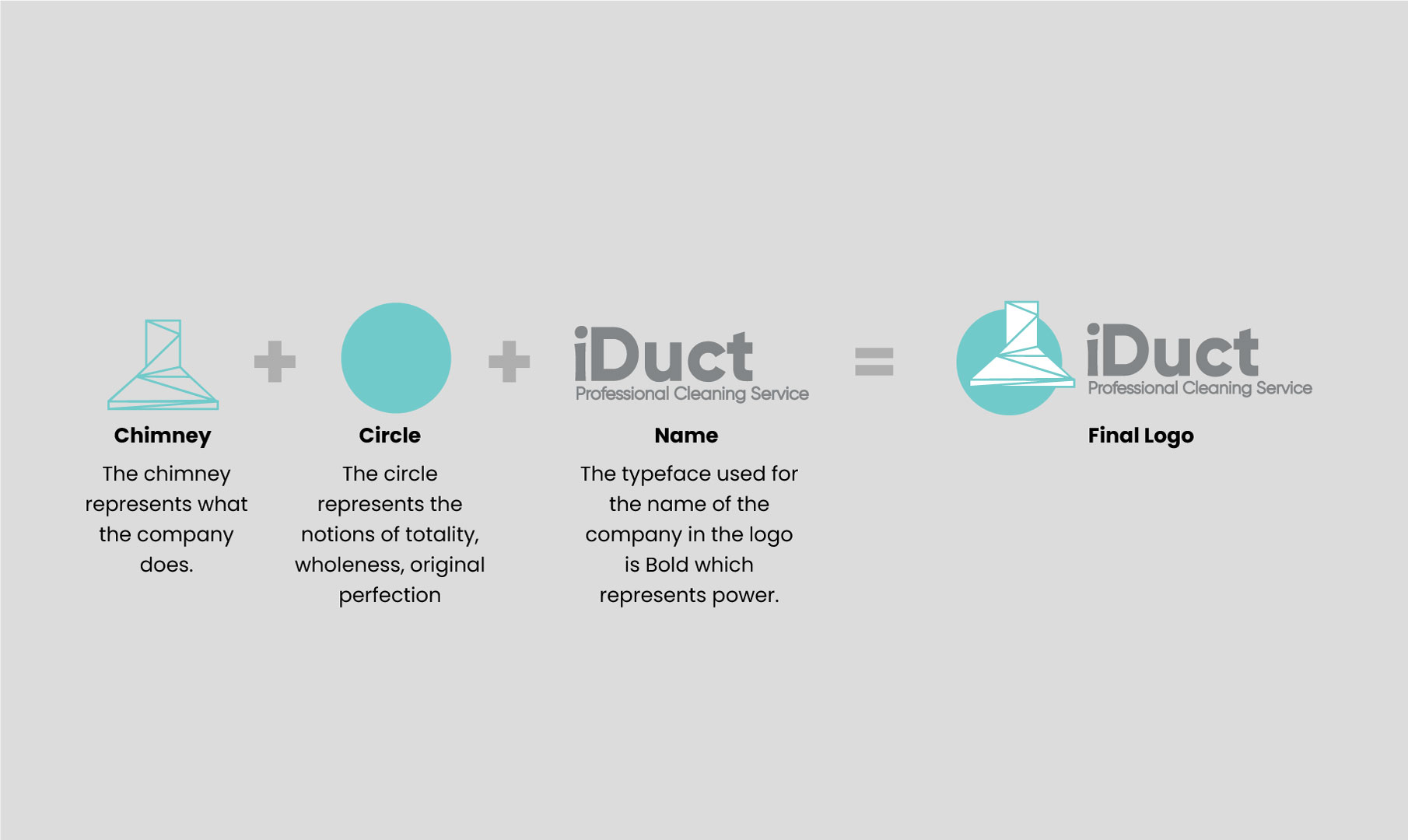
Using above information we worked on perfecting the concept of using chimney. We gave the design a modern twist by building the chimney using triangles. The typeface used was bold which reflected the confidence they had in their work and combined that with the striking and modern colors, gave them the brand identity they were aiming for. They were satisfied.
Using above information we worked on perfecting the concept of using chimney. We gave the design a modern twist by building the chimney using triangles. The typeface used was bold which reflected the confidence they had in their work and combined that with the striking and modern colors, gave them the brand identity they were aiming for. They were satisfied.
Final Result
The final logo beautifully encompaseses everything which the founders believe in. The logo clearly reflects the objectives and values of I-Duct, and is an identity which the founders creators feel confident in that it will help them grow and succeed.
Apart from the logo we worked on several brand collaterals such as company profile, business cards, letterhead, company profile video & website.

Previous logo


